


In October of 2016, Google announced its plan to move to a mobile-first index. Gary Illyes first explained this at Pubcon and then Google officially published a blog post covering the subject. It’s an important move and a 180 for search. Until now, Google has used the desktop URLs and content for ranking purposes, even for mobile rankings. That’s not optimal given the surge in smartphones and mobile usage, so they decided to make a switch.
With the mobile-first index, Google will instead use the mobile URLs and content for ranking purposes. Therefore, it’s critically important that site owners have their ducks in a row from a mobile standpoint (across several areas).
Tough(er) for m-dots
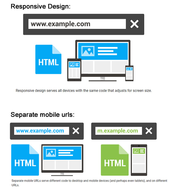
The move to a mobile-first index can be especially concerning for sites using separate mobile URLs (like m-dot subdomains). And that’s one of the reasons Google has been pushing responsive design as the cleanest approach for handling mobile. When using responsive design, the same HTML is delivered to all users, including structured data, hreflang tags and so on. CSS is used to change the rendering of the page based on viewport size. Since the same HTML is delivered for both desktop and mobile users, the move to a mobile-first index shouldn’t impact sites using responsive design at all.
But when using separate mobile URLs, you have a completely different set of pages. And those URLs could very well contain scaled-down content, a different internal navigation, no structured data, the wrong hreflang tags (or no hreflang tags) and so on. And that’s a dangerous situation with the mobile-first index rolling out. You also need to use the correct technical SEO setup to signal the relationship between desktop and mobile URLs.
Here is the difference between using separate mobile URLs and responsive design, from Google’s support docs:
Google’s John Mueller and Gary Illyes have both explained that having equivalent content on your mobile URLs is extremely important when preparing for the mobile-first index. In addition, other elements such as structured data and hreflang tags must also be present on your mobile URLs. You don’t want to be in a situation where your site moves to the mobile-first index and only half the content is being used for ranking purposes.
And recently, Google even explained that some sites have already moved to the mobile-first index! So yes, we are very close to seeing Google move more and more sites to mobile-first. Needless to say, site owners started to freak out a little.
Over the past several months, there have been many questions about how the mobile-first index will work, the types of problems that need to be rectified, and how Google will treat certain situations. There’s a lot of confusion, that’s for sure. Below, I’ll take you through some real-world mobile problems that I have uncovered while helping companies prepare for the mobile-first index. Let’s jump in.
Risky m-dot setups cause mobile-first problems
Since Google’s announcement about the mobile-first index, I’ve been helping a number of large-scale websites prepare. These are companies that either have separate mobile URLs (like m-dot subdomains) or are using dynamic serving, which provides different HTML and CSS based on user-agent. (Note: Dynamic serving is only a problem if there are significant gaps between the desktop page and mobile version. But there can still be problems, so keep an eye out.)
While helping these companies dig into their specific mobile setup, I have uncovered some very interesting problems. Therefore, I thought it would be valuable to share some of those problems so you can better prepare your own sites for the move to a mobile-first index. You never know, you or your client might be facing similar issues. And if you are, I recommend tackling those issues now, before the switch to m-first happens.
Botched bidirectional annotations = bad signals
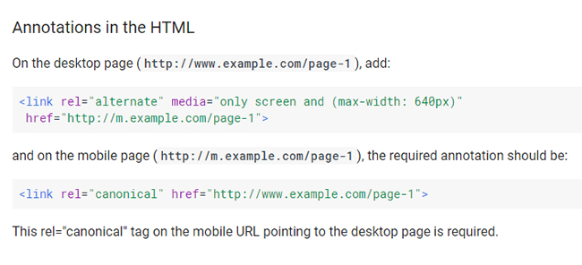
The first problem I’ll cover relates to the fundamental mobile setup a site should be employing when using separate mobile URLs. That’s where the desktop URL should contain rel alternate pointing to the mobile URL, and then the mobile URL should contain rel canonical pointing to the desktop URL.
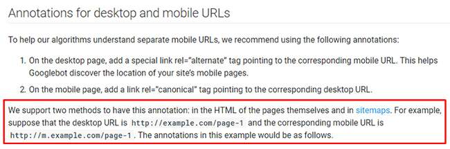
These bidirectional annotations signal the relationship between desktop and mobile URLs to Google. And this can help Google surface the correct URLs in the search results based on device, consolidate indexing properties across the URLs and so on. Google’s support documentation fully explains how to set this up.
During a recent audit, I noticed a few alarming things. First, there were many pages indexed on the m-dot subdomain. That shouldn’t be the case. If Google is properly canonicalizing the mobile URLs, then they shouldn’t be indexed. Note, there will always be some indexation of mobile URLs showing in Google Search Console (GSC), but you shouldn’t see a large percentage of URLs indexed there. For the company I was helping, I saw over 170K mobile URLs indexed, and it was rising!
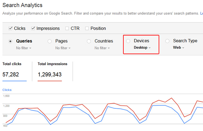
Second, mobile URLs were ranking on desktop. If you’re not familiar with this situation, it’s important to understand that this shouldn’t be happening. I saw over 57K clicks and over 1.2M impressions when checking the search analytics reporting for the m-dot (and filtering by desktop).
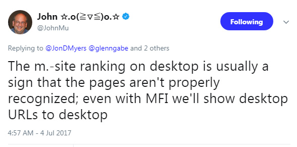
It’s also important to know that if mobile URLs are ranking in desktop search, that’s a clear sign there are technical problems with the mobile setup. Google’s John Mueller mentioned this on Twitter recently:
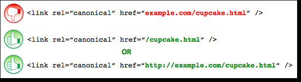
After digging in, I could see that the desktop pages contained self-referencing canonical tags (a good thing), but rel canonical was botched. The tags were using relative URLs rather than absolute, and since the URLs weren’t entered correctly, they created excessively long and concatenated URLs that led to 404s. Rel alternate was set up properly on the desktop URLs pointing to the correct mobile urls, but rel canonical wasn’t correct on those desktop urls.
Note: You can use relative URLs, but they must be entered correctly or Google may ignore rel canonical. Google even mentioned this issue in a blog post covering common problems when using the canonical tag. Here’s a graphic from the post illustrating the problem. The first line is incorrect and will append the domain name to a url that already has the domain name in it:
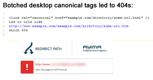
And here is how the urls were breaking. Notice the url example that 404s and how the domain name was incorrectly appended to the url:
Rel canonical was implemented correctly on the mobile pages, so the mobile URLs were correctly indicating the desktop URLs as the canonical version. However, since rel canonical was botched on desktop, the setup wasn’t working correctly. This led to over 170K mobile URLs getting indexed — and that’s why the mobile URLs were ranking on desktop search. Google was apparently seeing them just the way they would see other standard desktop URLs.
In addition, if Google doesn’t understand the relationship between desktop URLs and mobile URLs, the site could be diluting its efforts from an SEO standpoint. Google would not be consolidating indexing properties across each set of URLs (the desktop and mobile URLs). That could lead to weaker pages SEO-wise, weaker rankings, less organic search traffic and more. Not good, to say the least.
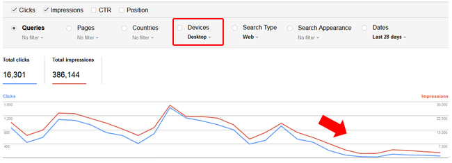
I immediately sent my findings to my client, and the fix was implemented very quickly (within two days). And you can already see desktop clicks and impressions dropping on the m-dot in Google Search Console (when filtering by desktop).
Double canonicals (header and HTML)
Another problem I surfaced that could cause serious problems overall (but especially with the mobile-first index looming) related to how a site was publishing rel canonical. I’ve written before about the power — and danger — of using the x-robots-tag. Using this tag, you can publish directives and rel links via the header response rather than in the HTML.
It’s powerful since it scales very well (it’s not in the HTML of each document). The danger is that it’s invisible to the naked eye. And when you can’t readily see the directives or rel links, there’s always a chance they could be wrong. And when they’re wrong on large and complex sites, they can wreak havoc on your SEO.
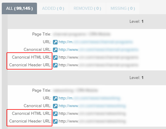
While recently auditing a site with separate mobile URLs, I surfaced rel canonical being published via both the HTML and the header response. So each page contained rel canonical twice. Since rel canonical is just a hint and not a directive, Google can ignore the canonical URL tag if it sees multiple tags (or if it just believes the site owner messed up). Therefore, when a site is using separate mobile URLs, the bidirectional annotations are critically important (as mentioned earlier). And you don’t want to publish multiple canonical tags across your URLs, including on your mobile URLs.
I sent this information along to my client, and their dev team is working on removing rel canonical via the header response. Once that’s completed, the company will be confident they are signaling to Google the correct relationship between desktop and mobile URLs. It’s better to rely on one hint versus multiple hints that possibly send mixed signals. Beware.
Pagination not set up correctly, especially on mobile.
Since I help a lot of large-scale sites, I’m often auditing and dealing with large amounts of pagination. It’s one area I’ve found to be extremely confusing for many site owners, SEOs and developers. Actually, I was surfacing so many similar pagination problems that I decided to write a thorough blog post detailing the correct setup for pagination, including how to set up sorting and filtering parameters. You can read that post if you need help with setting up your own pagination.

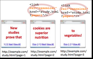
Well, during a recent audit of a site using separate mobile URLs, I noticed the pagination wasn’t set up properly, especially across the mobile URLs. Remember, the desktop URLs should contain rel alternate pointing to the mobile URLs, and the mobile URLs should contain rel canonical pointing to the desktop URLs. That’s on a one-to-one basis.
Therefore, each page of the pagination should contain self-referencing canonical tags. And the mobile URLs should contain rel canonical pointing to the desktop component pages. In other words, page two on mobile should point to page two on desktop, page three on mobile should point to page three on desktop, and so on.
The mobile URLs did contain rel canonical, but they were all pointing to page one on desktop. The desktop URLs were correctly set up with self-referencing canonical tags along with rel next/prev, but the mobile component pages were all being canonicalized to page one on desktop.
Needless to say, this is not the proper setup. And when the switch is made to the mobile-first index, Google would not index any of the content on the mobile component pages. Instead, only page one would be indexed. That’s not what this site wants based on their categories and articles, and it could lead to ranking problems (since content beyond page one would not be indexed at all.)
Don’t simply canonicalize component pages to page one in the pagination. That’s not the correct setup!
I sent my findings along, and the pagination code was fixed pretty quickly. Now the desktop and mobile pages all use rel canonical properly, along with rel next/prev.
Bonus: Rel alternate for mobile delivered via the header response. What?!
This problem is pretty sinister, since it’s easy for a company to falsely believe it’s correct across all of their desktop urls. During an audit of a site using separate mobile URLs, I noticed that rel alternate was being delivered via the header response (for connecting the desktop URL with the mobile URL). That’s different from delivering rel alternate via the HTML, which most sites have in place.
An example of rel alternate being delivered via the header response on a site with over 600K pages indexed:
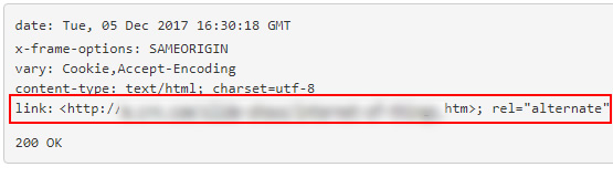
If you’re scratching your head now wondering why you haven’t heard much of this before, it’s because Google doesn’t support that method! So if you are delivering rel alternate via the header response to connect desktop URLs with their mobile counterparts, then you should change that as soon as possible. Instead, rel alternate should be delivered in the HTML or via XML sitemaps as documented in Google’s support center:
Quick tips based on helping a number of sites with separate mobile URLs:
As you can see, there are a number of mobile issues that can cause problems when sites get switched over to the mobile-first index (and those issues could even be causing problems now). Although I covered several important problems, I didn’t even cover content mismatch issues, missing structured data, hreflang problems, etc.
That’s why I recommend site owners take a hard look at their mobile setup now, before they get switched over to the mobile-first index. By identifying potential problems in the short-term, you can resolve them before they cause even bigger problems down the line.
Here are some quick tips based on helping a number of companies prepare:
- Crawl your site to understand all potential problems at scale. And make sure you run crawls as both Googlebot and Googlebot for Smartphones. Look for problems with bidirectional tags, canonical tags, hreflang, structured data and content mismatch issues across desktop and mobile. This can take a while, but it’s extremely important.
- Manually audit key sections and pages. Check for the correct technical setup. And don’t just check your desktop pages; check your mobile pages, too, and ensure the correct tagging is set up there.
- View your site the way a mobile user would. You can do that in a number of ways, from emulating mobile devices in Chrome to using real mobile devices at your office. I have several phones for testing purposes, including both Android and iOS devices. The combination of emulation and testing actual mobile devices works well to ensure I know exactly how the site is being handled across phones and operating systems.
- Review Google Search Console (GSC) to check mobile reporting. That includes the Search Analytics report and filtering by mobile devices versus desktop, checking indexation for your m-dot using the Index Status report, checking mobile usability errors, checking fetch and render, checking the robots.txt file for your m-dot versus desktop site, checking your hreflang setup, reviewing your AMP reporting and more. Seriously, there’s a boatload of data in GSC that can help you. Use it.
[“source=gsqi”]