

Do you want more mobile subscribers and readers?
Is your blog suitable for a mobile device?
In 2012, mobile users spent 63% more time on their devices accessing mobile websites and apps and this is set to increase.
In this article I’ll explore the importance of mobile for your blog and the different options available to support your blog on a mobile device.
Is Mobile Important for Your Blog?
Yes! An increasing number of your readers will access your blog from their mobile devices. Smartphone usage will continue to increase and don’t be surprised if more people access your blog from a mobile device rather than a desktop in the future.

Before you make an investment in this area, it’s useful to check your analytics to find out how many people access your blog from a mobile device.
Most analytic programs will provide you with this information.
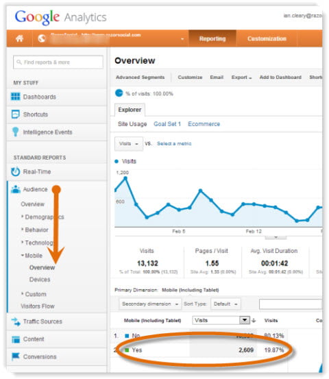
If you use Google Analytics, under the Audience section, select Mobile > Overview. This screen shows you the amount of traffic that comes from a mobile device. Switch to a pie chart view and you will see the percentage of your site’s traffic that is coming from mobile.
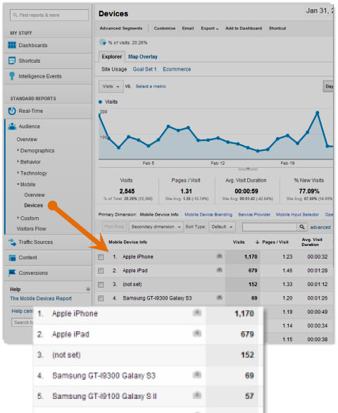
Under Devices, you can see which mobile devices your visitors use. In this example, you can see the iPhone and iPad are the most popular options. Although an iPad has a larger screen size than an iPhone, there are still potential issues viewing your blog through it.
Do your sharing icons work on the mobile device? Can users comment? Is there far too much scrolling to the right required?
From the example above, close to 20% of all the traffic comes from a mobile device. Is that something you can ignore?
Check out your site. What percentage of traffic do you get from mobile devices? Has this increased? Is it likely to increase further?
How to Test Your Blog
The best way to test your site is try to view and interact with your blog from a variety of mobile devices (iPhone, iPad, Samsung Galaxy, etc.).
To test your site, go to the Mobile Meter page, enter in your website address and click Test Your Site.
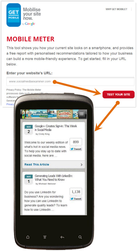
Google will display an image of how your website looks on a mobile device and then ask you a series of questions related to what your website is used for, if the content displayed is readable and so on.
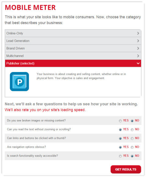
Based on your answers, Google will display a summary of results and give you an option to download a PDF document that will give you more detailed recommendations.
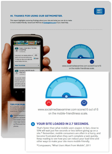
It’s a very basic tool, but the recommendations in the document will help you understand the typical issues users have and will provide some tips on how you can adapt your site to suit its primary purpose.
What Are Your Options to Support Mobile Visitors?
There are many options to create a mobile version of your website. The following includes the most likely options that you will consider.
#1: Make no changes to your website
If you make no changes to your website to support mobile, your visitors will still be able to access information through a web browser on a mobile device.
However, it’s highly likely that your website will not operate correctly on a mobile device. The typical issues are:
- Too much scrolling to the right required—The website does not fit correctly on a mobile device, so visitors have to scroll a lot over to the right to access information. Mobile users are typically impatient, so it’s hard to keep them on your website if this is the case.
- You have to pinch all the time—If your content is too small to read, you end up pinching the content with your fingers to enlarge it. This then makes it easier to read but introduces more scrolling!
- Images and videos not adjusted—On your website, you have room to display larger images and video, but on a mobile site you can’t see the entire image or video on the screen without scrolling.
- Speed—On a mobile device you don’t always have the same speed connection you would with a desktop. You need to consider the download time of your pages. If you build a mobile website correctly, you can reduce the size of the image and you don’t sacrifice quality because the image is displayed on a much smaller screen.
The use of mobile/tablet devices will continue to grow. So if you are not prepared to make changes now, you should consider a plan for the future.
#2: Build a separate mobile version of your website
If you build a mobile version of your website, you will effectively have two websites—one for a desktop and one suitable for a mobile device.
A separate mobile website is generally displayed like the following—m.yoursite.com.
When someone visits your website from a mobile device, they are automatically redirected to your mobile website. With a separate mobile website, you can have different content, layout images, etc. on the site.
How to build a mobile version of your website.
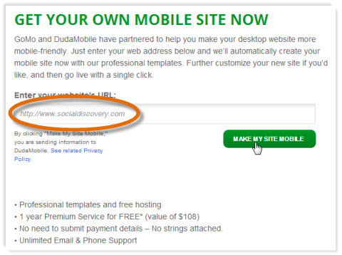
You can go to your developer and ask him or her to build a mobile version of your website or you can use tools that are available on the web. For example, Dudamobile provides software to build a mobile site.
How to Go Mo has partnered with Dudamobile to provide free mobile websites for up to one year.
If you go to the Build Your Site section, you can enter in your website address. Select the option Make My Site Mobile.
If your site is a blog, it will identify this and give you the option to either stick with the blog layout style or switch to a website layout, which presents you with a different range of templates to choose from.
Choose to keep it as a blog and then select the template you want to use for your mobile site.
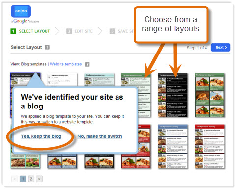
There is a suite of templates available that are suitable for a blog, so pick the most appropriate one.
Once you choose your template, there is a very straightforward process you follow for completing the site.
On the first screen you can edit the site design, which includes customizing the background, font and colors for most of the elements on the screen such as the header, the blog home page, the blog post page and so on.
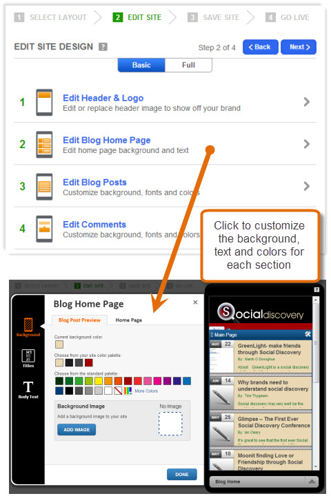
Here is an example of the Social Media Examiner site with an addition of a header at the top. As you can see, the blog content is clearly laid out in a simple format that makes it easy for visitors to find a relevant post.

If you want to get a bit more adventurous, then you can also add new content to your mobile site such as sharing icons, a Twitter feed, contact forms, images, text and so on.
Click on Full to see the various options available. Then simply drag and drop the item onto the place on the screen where you want it to appear, and then you can customize its appearance and properties.
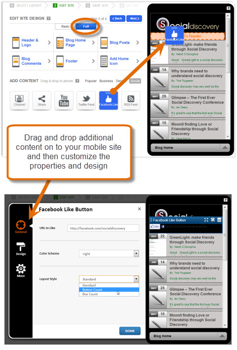
You can also add design elements to the site such as tabs, dividers, buttons and much more. You can even add some of your own custom HTML.
When you are happy with your site design, you need to save your site. First you are asked to enter your email address and password to create an account on the Dudamobile website.
Once you do this, the site is now saved and you are immediately given an address for your mobile site. If you do not want Dudamobile in your address, you can switch to the paid version and get your own mobile website address (for example, m.socialmediaexaminer.com).
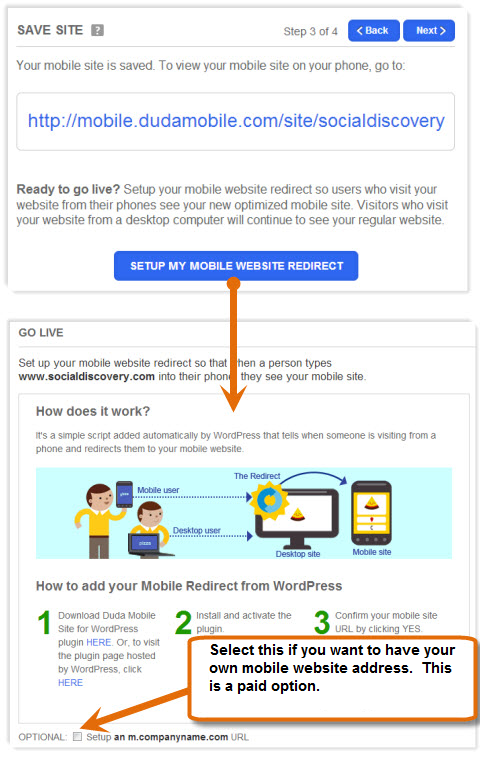
If you use WordPress, you can now set up a mobile website redirect that automatically redirects visitors to your mobile version if they arrive on your website from a mobile device.
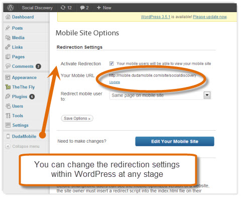
You will need to install the Dudamobile plugin to your WordPress site, confirm your mobile address and then you’re active. Now mobile visitors will automatically go to your new website.
#3: Use a Mobile-Optimized Theme
A mobile-optimized theme means that you only have one website, but a different version of it is displayed when visitors are on a mobile device.
The theme created is very suitable for a mobile device. It is generally light on graphics and any complicated functionality.
Creating a mobile-optimized site using WPtouch.
There are various WordPress plugins available that allow you to create a mobile version of your website. One of the more popular ones is WPtouch.
WPtouch creates a very simple mobile-optimized template for your content. You then only have one site with one web address, but a much simpler version of the site is displayed on the mobile device.
Install WPtouch the same way you would install any WordPress plugin. When you enable it, you will automatically have a mobile version of your website. Seriously, it is that simple.
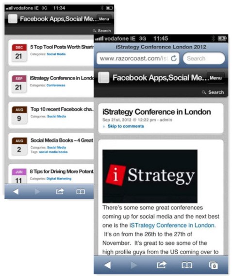
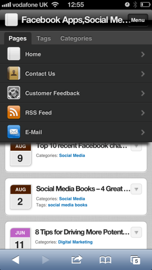
In the example below, you can see how the blog posts are displayed in an easy-to-navigate list.
When you open up a blog post, it is sized correctly for a mobile device.
Within WordPress, the plugin gives you a lot of different configuration options depending on your requirements. For example, by default the menu only contains three options—Home, RSS Feed and E-mail.
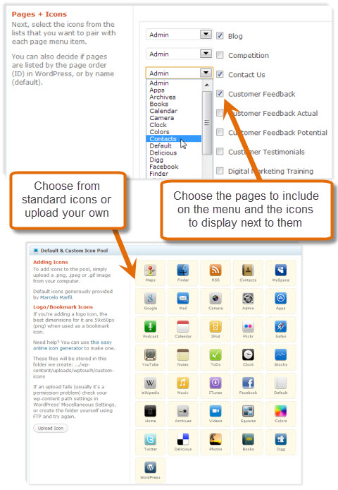
If you want to add other menu options, go to the section for Pages and Icons. Select the menu options you want to appear and the icons to associate with each option. You can either choose from a library of standard icons or you can upload your own.
Your menu will now have the options you have selected.
WPtouch is free but there is some paid support for devices and functionality that you may want. For example, with WPtouch Pro you can get the following features:
- Support for multiple languages
- Enhanced support for advertising
- Improved administration
- iPad theme support
- Better support for comments
- Support for multi-level menus
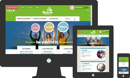
#4: Build a Responsive Design
A responsive design means that your content automatically adjusts to the size of your device. You have one website and one set of content, but depending on what device you display it on, it is automatically laid out differently.
Imagine if you had three columns of information on a desktop device. On an iPad, you may only display it in two columns, or one column on an iPhone. Any information that cannot be displayed gets moved below, therefore eliminating any scrolling to the right.
#5: Build a Native Application
If you have a smartphone, you can download applications to run directly on your phone. These are called Native Applications.
You can build a really nice user interface that is suitable to specific phones and use some of the functionality available on the phone (e.g., the camera).
It is possible to build a native application for a blog but it is not a good option. You would end up building several native applications (e.g., one for Apple iOS, Android, etc.), which would be very expensive.
[“source=socialmediaexaminer”]