 Squeezable sides are a very bad reason to buy a phone. Especially now, when the U11’s Edge Sense doesn’t do a whole hell of a lot. Who knows, perhaps one day it will do much more than simply launching favorite apps. But even then, squeezable sides will be a very bad reason to buy a phone.
HTC has done itself a disservice banking on a goofy gimmick with its new flagship. The Edge Sense’s “new age of phone interactions” really buries the lede, as we say in the business.The U11 is a good and capable phone. A fact that embedded sensors in the phone’s frame have very little to do with.
Here is a list of things to like about it: lovely and unique design, the latest Snapdragon processor (835), a water-resistant body, a good camera and solid sound for a smartphone. It’s understandable that a company struggling the way HTC has of late might scramble to stand out from the crowd, but Edge Sense isn’t what’s going to do it.
Water under the bridge
By the time I met with HTC to discuss the U11 ahead of launch, the company had switch tacks slightly. Most of the ad material around the new phone still centers around Edge Sense, but when time comes for the company to actually talk about the phone itself, it smartly highlights the design. Granted, as my parents have unhelpfully told me time and again, looks aren’t everything. But they’re a driving force in many people’s phone buying designs.
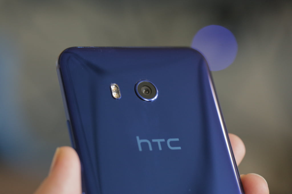
And the U11 is a legit looker. I got compliments from jaded coworkers, which are better than just regular compliments, because they’re coming from angry people whose job it is to look at phones all day. HTC calls the design “Liquid Surface,” because, no joke, it looks like it was dipped in liquid. The company introduced the design on the U Ultra back in January — a handset the U11 more or less effectively renders redundant less than half a year after its release.
HTC achieved the standout look by covering both sides in glass — which comes with its own drawbacks. First are the fingerprints, which are sure to awaken any slumbering bit of OCD in your soul. They’re there and they’re not going away. Sorry. Second, and more importantly, it’s just not as strong as metal. Even Gorilla Glass (5 on the front and 3 on the back, owing to the scratch vs. shatter tradeoffs of each) isn’t insurance against a fall. For the clumsiest among us, the new look probably isn’t worth the potential tradeoff.
Even so, Liquid is going to be a sort of unified design language for the company moving forward. It’s curvy, it’s shiny and it’s a smart move, getting away from the busyness older phones like the One, while still retaining the familiar HTC shape. It’s like what Samsung and Apple do with their phones — creating a unified look that makes a brand instantly recognizable, regardless of model number. It’s a smart move and it’s a good look for HTC: minimalist, yet still recognizable.
Outsourced assistants

If I told you that Sense Companion is still kicking, you might rightfully respond, “great! Also, what is Sense Companion?” To which I would helpfully answer, “it’s basically HTC’s version of Bixby.” Which is to say, it’s an attempt at an in-house assistant that doesn’t actually assist that much.
Really, it’s more akin to an information hub that uses some contextual clues to serve content. Perhaps HTC never had grand plans for the assistant. Or maybe it’s just accepted the fact that few of its users are going to opt-in for Sense Companion over better made/more well-known alternatives. The company’s VP of product design told me recently, “We’ve never envisioned Companion as a wake word-type assistant,” which seems to imply that HTC knew its limitations from the outset. Whatever the case, its offering now exists more to augment what is an embarrassment of smart assistant riches.
In fact, HTC built the on-board mic system with other smart assistants in mind — namely Google Assistant and Alexa. There are four mics on-board here both for better audio recording and so it can reserve a mic apiece to always-on listening for those two assistants. Privacy concerns about that functionality aside (though there are plenty), points to HTC for knowing the limitations of its own assistant (take note, Samsung) and for giving users the option of two of the most popular assistants baked into the device (though Alexa functionality is still forthcoming).
If this means we won’t be getting a Sense Companion version of the Echo/Home/HomePod any time soon, well, that’s just a sacrifice we’ll have to make.
Sounding board

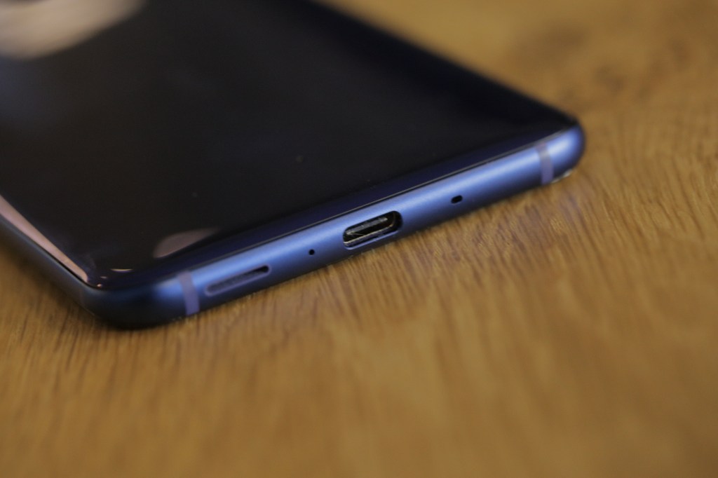
As ever, HTC gets points for seemingly being the only phone maker that cares about on-board audio. The U11 sounds a lot better than most of the phones out there, though part of the company’s drive toward Liquid minimalism means the front-facing speaker grilles are gone. Instead, music playback is reserved for the phone speaker and a small port on the bottom. It’s a step back in favor of aesthetics, but it’s still leagues ahead of the competition — though anything longer than a quick YouTube video is better left to a Bluetooth speaker.
On a related note, the company dropped the headphone jack on the Ultra earlier this year, and that’s still the case here. As a rep matter-of-factly told me earlier, “The headphone jack is going away. Let’s just get on with it.” Not the best justification for removing a once universal truth, but still probably accurate. You can’t stop the tides of change, you can only hope to upgrade all of your headphones.
What’s left adds up to a solid , if unexceptional flagship. At 5.5 inches, the display is on the larger side for HTC, with a bright and colorful quad HD resolution. The camera’s also quite good, in fact, it edged out the Google Pixel’s terrific 89 DXOMark score by a point. And HTC’s done a lot to bolster the experience like super fast autofocus and a combo electronic/optical stabilization system. And since it’s 2017, the front-facing camera also gets a healthy bump, boosting HDR speed and reducing image noise.
Feeling the squeeze

You can’t really blame HTC for leading with a gimmick. Like LG, the company’s been having a rough go of things lately, and it’s spent much of the last couple of years fumbling in the dark. A glut of cheap handsets have eaten into the company’s market share on the low-end, and things don’t seem much better on the flagship side where a handful of big players like Apple and Samsung have a tight lock on things.
Odds aren’t great that the U11 will do much to reverse those fortunes. You can build a solid handset, but when your standout feature doesn’t stand out, best of luck to you. It becomes all the more complicated when you lock yourself into US carrier exclusivity with the country’s fourth largest carrier (a lesson Essential is about to learn the hard way).
The U11 isn’t doomed to failure. There’s a lot to like here, from the unique design language, to the embrace of multiple smart assistants, to a quality camera experience. What it doesn’t add up to, however, is a stand-out device that presents a solid reason to buy this flagship over any other.
HTC’s struggling smartphone wing has dug itself a hole too deep to escape with just a good phone. It needs a big win to reverse its fortunes in the smartphone arena, and more than likely the U11 isn’t it — squeezable sides or no.
[“Source-smallbiztrends”]

