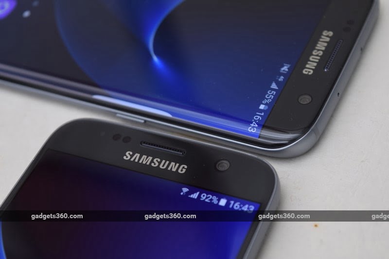
Last year’s Samsung Galaxy S6 launch was a huge departure for a company that had begun to take for granted that its name was synonymous with Android. After years of doing pretty much anything it liked and still staying at the top of global sales charts, Samsung was starting to see signs that plastic phones with bloated software and thoughtless design weren’t going to cut it anymore, especially when the rest of the industry was beginning to ship phones that felt luxurious and slick.
Naturally, we all took notice when Samsung ditched nearly all of its long-held traditions and launched the gorgeous metal-and-glass Galaxy S6 (Review | Pictures). Moreover, it made its debut with a sibling, the Galaxy S6 Edge (Review | Pictures), a truly unique device that just oozed cutting-edge style, but of course at a premium. Not all was right, though – users complained that the Galaxy S6’s makeover was a step too far, and lamented the loss a removable battery, microSD card slot, and water resistance.
It’s been a year since then, and now even sub-Rs. 10,000 phones can boast of metal bodies and most of the features that used to set flagship phones apart. The Android market, especially in India, is a lot more crowded than it used to be, and Samsung is not untouchable at the top anymore.
Samsung, therefore, has multiple challenges when it comes to its Galaxy S7 family: the phones have to outdo their predecessors, appeal to purists without taking any steps backwards, and most importantly, feel like they’re worth spending a lot of money on when the next best options are good enough. We’re going to see whether or not the Samsung Galaxy S7 and Samsung Galaxy S7 Edge deliver on all these counts.
 Look and feel
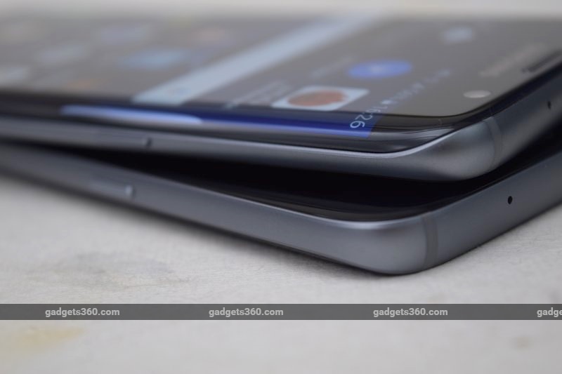
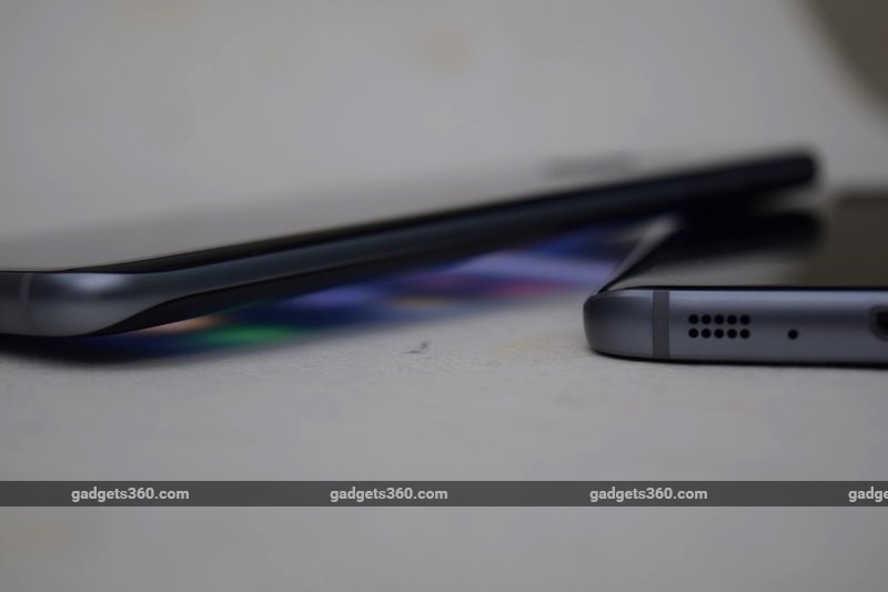
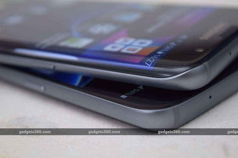
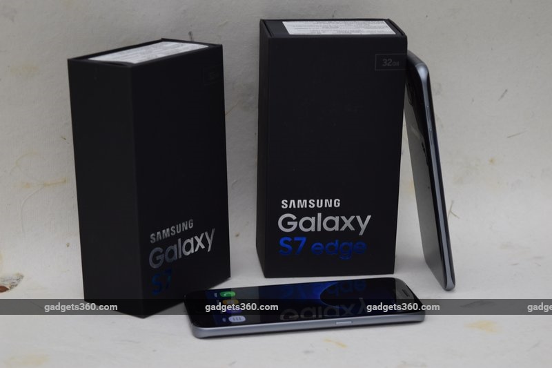
Samsung has differentiated the Galaxy S7 and its curved sibling a bit more than it did last year. Buyers of the recently launched Samsung Galaxy S6 Edge+ (Review | Pictures) might be a little miffed, since the S7 Edge effectively replaces it as well. The S7 Edge is certainly a handful, but it isn’t totally unmanageable. The biggest problem with it is that the glass is so slick and the metal edges so narrow that we didn’t always feel that we had a secure enough grip on it.
The more vanilla Galaxy S7, however, seems to fit perfectly in the hand. The curved back and flat sides gave us more than enough control. The glass front is still a bit extruded and has gently rounded edges, which meet the metal as if flowing into it.
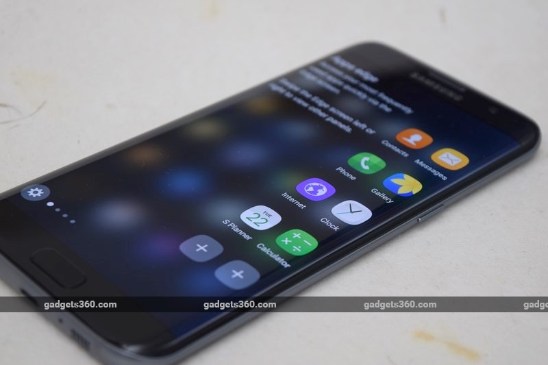
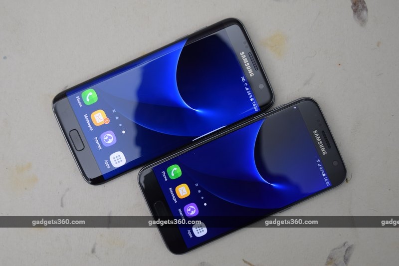 When it comes to the choice between a flat and a curved display, each has its own appeal. Using the Galaxy S7 after having spent time with the S7 Edge feels almost constricting. You become very aware of the hard rectangular screen border, whereas the S7 Edge feels boundless. However, content does wrap around the edges, so it’s sometimes hard to hit buttons on the curved screen, and you lose a little bit of the picture when playing games and watching movies. As we noted with the Galaxy S6 Edge, the curved glass will pick up reflections no matter how you hold it, and that can become annoying when trying to focus on content.
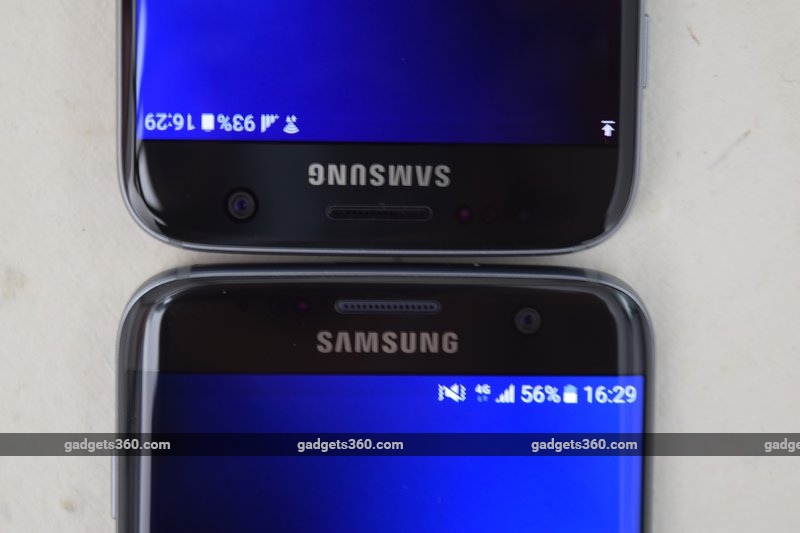
The displays of the two phones are different in more ways than just shape and size. We found that at least for our review units, the Galaxy S7 looked a little darker and crisper, while the S7 Edge didn’t have as much contrast and in fact had a slightly more yellow colour tone. None of this would be apparent if you didn’t hold the two side by side; they’re both very impressive screens, befitting their status as flagship device displays.
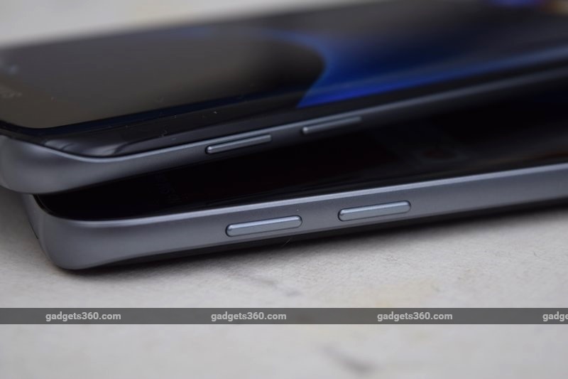
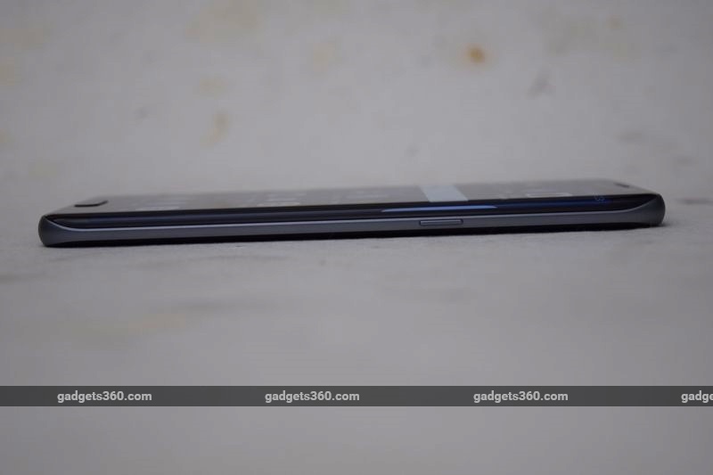
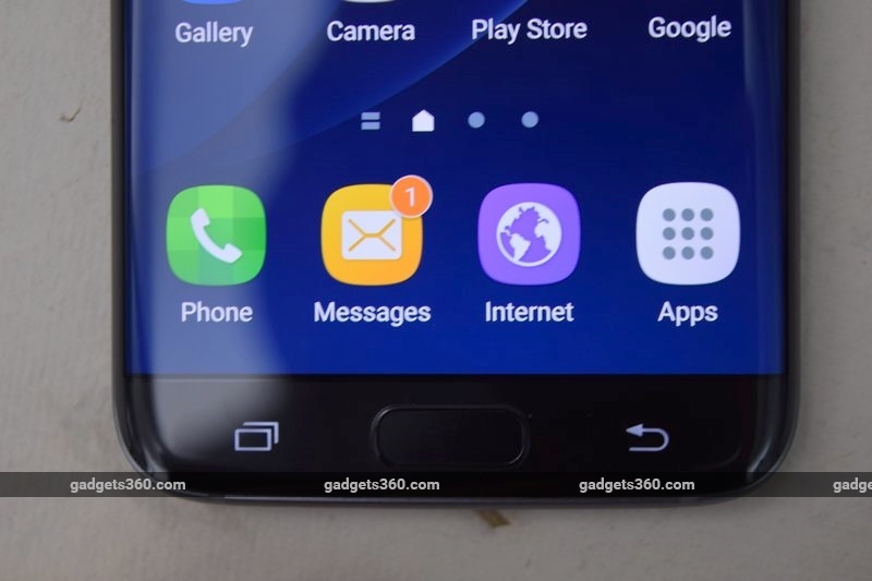 In most other respects, the two siblings are identical. Everything is in the same place on both: a physical home button with integrated fingerprint reader below the screen, capacitive Back and Recents buttons, a power button on the right, and volume buttons on the left. The physical ones on the S7 Edge are a little narrower, but no more or less easy to use.
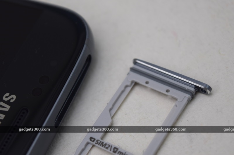
For some reason, Samsung decided not to jump on the USB Type-C bandwagon, as nearly every other company already has. Both phones have standard Micro-USB ports on the bottom, with a 3.5mm audio socket to the left and a small speaker grille to the right. A tray on the top can hold either two Nano-SIMs or one Nano-SIM and one microSD card. While we’re never happy to see hybrid slots which force users to choose, it is at least a step above the Galaxy S6 series which dispensed with storage expansion and didn’t give users any choice in the matter at all.
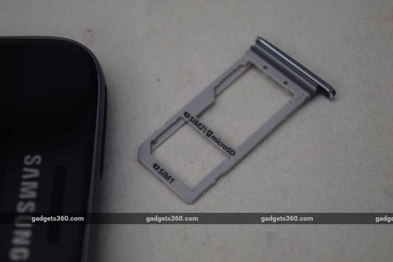 Another interesting thing about the phones’ SIM trays is that they have rubber flanges to protect against ingress. Both phones are rated IP68 for water and dust resistance, and they have achieved this without flaps covering the ports – one of the most polarising features of the Galaxy S5 (Review |Pictures).
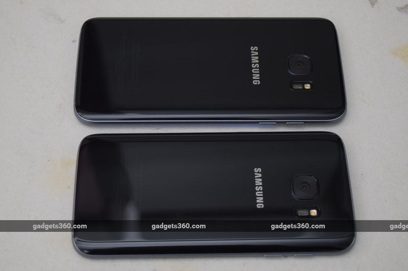
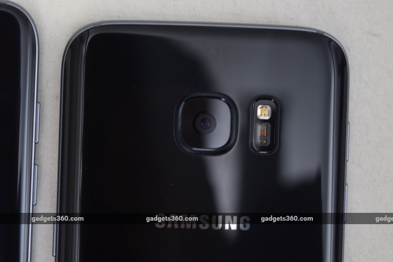
Samsung has managed to shave down the camera bumps on the rear so that there’s barely more than a protective ring around the lens on both phones. Each one has an identical module to the right, comprised of the flash and a heart rate sensor. There’s a shiny silver Samsung logo lower down, and only if you look really hard will you see the incredibly light regulatory text near the bottom.
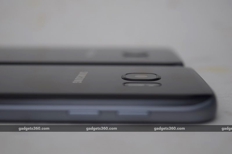 We received test units of both the Galaxy S7 and the S7 Edge in Black Onyx, which is actually a little grey. We couldn’t help but see faint echoes of the Space Grey iPhone 6 in the dull metal frames of both these phones. The other colour options are Gold Platinum and Silver Titanium – it seems the bright jewel colours of the Galaxy S6 series haven’t been carried over.
The phones do seem durable, though of course falls onto hard surfaces will leave dents and dings. However, one thing that became apparent within days of using them is that the surfaces of Home buttons get scuffed really, really easily. We didn’t do anything rougher than carrying these phones in our pockets, but both buttons got scratched up virtually overnight. It was especially apparent given the pristine glass surrounding them.
 Specifications
Other than screen size and battery capacity, the Galaxy S7 siblings share a lot of the same guts. The Galaxy S7 has a 5.1-inch screen while the one on the S7 Edge measures 5.5 inches diagonally. Both are Super Amoled panels, and both have the same resolution of 1440×2560 pixels, or Quad-HD. While the smaller of the two has a 3000mAh battery, the bigger one has enough space to accommodate 3600mAh unit.
Samsung sells these phones with its own Exynos 8890 SoC in India and some other countries, while others get Qualcomm’s Snapdragon 820. The Exynos 8890 has eight CPU cores, four of which are a custom in-house design called Mongoose and run at up to 2.6GHz, while the other four use ARM’s Cortex-A53 design and run at 1.5GHz. It also features integrated ARM Mali -T880 graphics, and LTE Cat 12/13 support. These are all cutting-edge specs and performance should be equivalent to that of the Snapdragon 820 – though proprietary features such as Qualcomm’s Zeroth AI platform don’t seem to be accounted for either way.
 There’s also 4GB of RAM, and 32 or 64GB of fixed storage (though the 64GB versions of both phones are not yet available in India). MicroSD card support goes up to 200GB and USB-OTG is available as well, which might be why there’s no 128GB option. You get Wi-Fi b/g/n/ac, Bluetooth 4.2, NFC, ANT+ and GPS, but Infrared has been dropped, so you lose the Galaxy S6’s handy remote control feature.
Samsung boasts of a whole new camera system, with 12-megapixel primary sensors and optical image stabilisation for both phones. The megapixel count might seem low, but Samsung promises bigger physical pixels that capture much more light, improving autofocus speed and performance in dark conditions.
 Software
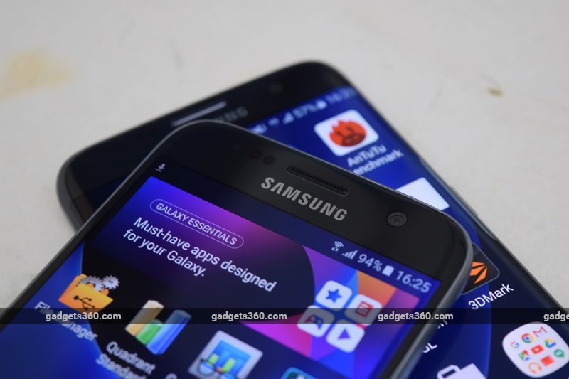
While we were relieved to see Samsung scale back on its bloat with previous incarnations of TouchWiz, it still has a relatively heavy hand when it comes to Android skinning in the Marshmallow era. The homescreens are a little cluttered, but you can get rid of Samsung’s promotional “Galaxy Essentials” widget which offers apps and themes for download.
Interestingly, you can switch to a single-layer UI which dispenses with an app drawer and moves all icons to the home screens. This is buried in the Settings under a Galaxy Labs section, which lets you try and vote on “experimental” features. Either way, The left-most homescreen is a Flipboard-powered news reader, very much like HTC’s BlinkFeed. There’s also a Theme Store with free and paid options in case you don’t like the default icons and wallpapers.
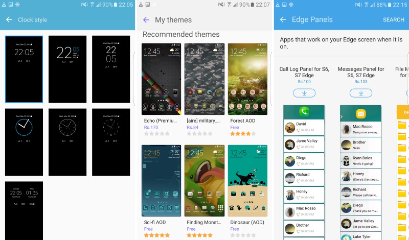
 We particularly liked the Always-On Display feature, which takes us back to the days of Nokia’s S60 phone screensavers. Thanks to the way Amoled screen technology works, it takes very little battery power to light up individual pixels, and so Samsung can display the time, battery status and notifications in simple white on black whenever the phone is in standby. You can have a subtle image behind the text, and you have a few choices of clock style. Honestly, it’s a little disconcerting to see the screen lit up all the time, and we wish we could have controlled the brightness – it can only be turned off completely.
The Galaxy S7 Edge has a few unique touches, such as being able to flash a specific colour for a few designated contacts, and a clock that you can see at night if you’re lying down. The most notable though is its Edge Panels. Pull the floating white tab on the right inwards to reveal a series of vertical strips – one for app shortcuts, one for shortcuts to common functions within the default apps, one for people, and one for news. You can flip through these by swiping a thumb, and you can download more from Samsung or third parties.
 Many of these extras are free, but others cost around Rs. 100 each, which seems a bit pointless for panels that just duplicate existing functions such as the quick settings and call log. Much like the similar implementation on BlackBerry’s Priv (Review), we wound up largely ignoring the Edge Panels after the novelty wore off. We also couldn’t see anything about this feature that explicitly requires a curved screen – it could work just as well on the flat Galaxy S7.
Common to many of Samsung’s Galaxy phones is split-screen view. This works with most of the preloaded apps, and the S7 series phones have enough screen space that you can use two apps comfortably. All you have to do is long-tap the Recents button, or use the control visible on thumbnails in the app switcher. You can also shrink apps down to smaller windows, though you can’t drag and arrange them on screen.
 Samsung has preloaded quite a few of its own apps as well as several from Microsoft, Facebook, and of course Google. They’re all sorted haphazardly – Word is on the homescreen, but Excel, PowerPoint and OneNote are in a folder called Microsoft Apps. Skype is also in this folder, but WhatsApp and Instagram are in a different folder called Social. Several of the preloaded apps can’t be uninstalled but can be “turned off” which removes all visible traces of them till you turn them back on through the Settings app.
Similar to Apple and the Watch app, Samsung gives us its Gear watch manager whether we need it or not, along with S Health and S Voice. Galaxy Apps is a storefront that offers a variety of apps, at least some of which seem useful and not spammy. Many of the apps that Samsung would at one time have forced on users, such as S Note and S Translator, can be found here. This is also where S7 Edge users will find more Edge Panels.
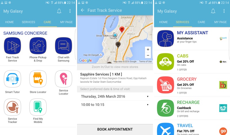 Yet another app called My Galaxy contains shopping offers and is also the gateway to Samsung’s Concierge services for S7 buyers in India – you can book an appointment at a service centre, schedule a pickup and drop, or chat with a representative for tech support. When we tried it, we found it was too easy to accidentally book an appointment, and no way to cancel it. There were also no agents available for live chat support, but that will likely change when the phone is available to the general public.
Cameras
Most of the hardware and material quality of last year’s flagship-class phones can be found in today’s mid-range ones – or at least enough that the margin of difference doesn’t matter. One of the only things that you can still get only with the traditional idea of a top-level phone is a really, really good camera. Samsung promises it has outdone itself yet again, and we have no reason to doubt it – we’ve been thoroughly impressed with the Galaxy S and Galaxy Note series thus far.
 Samsung’s camera app is simple but there are lots of controls and features beneath the surface. Motion Photo is a feature like Apple’s Live Photos – a few seconds’ worth of video is constantly buffered and saved when you press the shutter button, giving you a bit of spontaneity. One of the most useful features of both phones is that you can double-tap the Home button anytime from within any app or even the lockscreen to jump straight into the camera app.
There are ten modes including a Pro mode with presets for the various controls, and Virtual Shot which lets you circle around an object to do a 360-degree shot without a turntable. Selective Focus, Slow Motion, Hyperlapse, and even Food round out the options, but more such modes can be downloaded, including Rear-cam Selfie, Animated GIF, and Dual Camera. There’s a section for paid downloads but nothing in it so far.


 (Shots taken with the Samsung Galaxy S7. Tap to see full size)
Nearly all the photos we took came out looking phenomenal. There really is no difference between the two in terms of quality and capabilities. Subtle details such as the texture of a rope or flecks of rust on a pipe came through in vivid detail. Frames with shadow and light were handled perfectly, with almost nothing lost. Macros taken against distant backgrounds looked the best of all, as they tend to do with all phone cameras.
Where both phones really shone was in low-light situations. This is quickly becoming the most important parameter for phone cameras, and we were honestly amazed with some of the things the Galaxy S7 siblings could do. They aren’t capable of night vision when it’s pitch black, which is understandable, but they can work wonders with even tiny amounts of ambient light. Photos taken on the road at night, with only ordinary city streetlamps casting light, came out sharp and vivid although with a heavy amber colour cast. Some of the samples here will look like they were taken with a floodlight or studio equipment just outside the frame, but that was simply not the case.


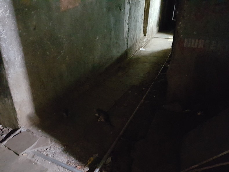
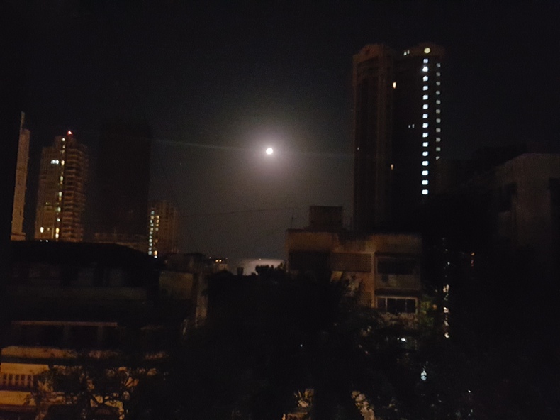 (Shots taken with Samsung Galaxy S7 Edge. Tap to see full size.)You can record video at up to 4K with the rear camera and 1440p with the front camera, which is unusual but definitely not unwelcome. Videos are just as crisp as we expected, and we have no complaints at all.
We did notice with both phones that there is no cue on screen as to when focus is or isn’t locked. When taking a few shots in quick succession, it often seemed that giving the phone just a second or two more would result in a much sharper picture – especially at night. Other times, the shutter button just didn’t do anything till we repositioned the phone and allowed it to refocus, which was frustrating. A few photos came out shakier than they should have despite the camera having OIS. All of these little things seem to be software issues, and we hope Samsung issues updates to take care of them.
 Performance
We had a great time with both, the Galaxy S7 and the Galaxy S7 Edge, but we wound up preferring the vanilla S7 in terms of ergonomics and usability, though your mileage may vary. While the S7 Edge is undoubtedly gorgeous, it’s a bit unwieldy, in our opinion, and full pages of text are usually less easy to read on screen.
It should go without saying that pretty much every app we threw at these phones worked well, even games. Heavy video files also played very well. Sound from both phones’ speakers was loud and didn’t distort, but immersiveness was lacking. We didn’t notice any heating except when the phone was plugged in. Samsung says this is normal, and you have the option to disable fast charging for this very reason.
 Our Samsung Galaxy S7 seemed to have trouble latching on to 4G networks indoors, often showing only Edge reception. It also threw up occasional errors, such as telling us that background data had been disabled – even immediately after a factory reset. The S7 Edge had no such problems, so we hope they were down to a problem with the specific unit we received for testing.
Benchmark scores were all absolutely phenomenal, reaching levels we’ve never seen before. The Galaxy S7 pushed out 128,140 in AnTuTu and 55,642 overall in Quadrant. Geekbench’s single-core and multi-core scores were 2,086 and 6,431 respectively. BrowserMark gave us a result of 3,309 points. As far as graphics go, 3DMark’s Ice Storm Unlimited run threw out an eye-melting score of 27,830, while GFXBench ran at 53 fps.
 The Galaxy S7 Edge did just as well. All scores recorded by both phones were within reasonable margins of each other, with perhaps only a very slight advantage going to the S7 Edge – the only possible explanation would be less aggressive thermal throttling due to its larger body. We saw 128,769 in AnTuTu, 53,784 in Quadrant, 2,087 and 6,518 in Geekbench, 3,274 in BrowserMark, 28,677 in 3DMark Ice Storm Unlimited, and exactly the same 53fps in GFXBench.
Battery life was a different story, with the Galax y S7 Edge’s 20 percent capacity advantage largely wiped out by its bigger screen. It lasted 17 hours, 49 minutes in our video loop test. The smaller Galaxy S7 lasted a relatively more efficient 16 hours, 26 minutes. With regular use involving lots of 4G data use and a bit of gaming and videos, both phones lasted at least a full day and through the next morning. Quick charging worked perfectly well – it’s the kind of thing you can’t live without after getting used to it.
 Verdict
Clearly, the Galaxy S7 siblings are excellent smartphones, and do pretty much everything that their predecessors can do, but better. If you want bragging rights and money is no object, these are two very compelling options. You’ll be certain to dazzle your friends by taking incredible pictures at night and in dark places. You also get health monitoring and the Concierge services to show off – things that don’t come with just any old phone, at least not yet.
When it comes to deciding between these two phones, it really comes down to which size you’re more comfortable with, and whether or not you think the curved screen is worth paying a significant premium for. You lose nothing in terms of features by sticking with the more conservative Galaxy S7, but the S7 Edge offers a kind of thrill and satisfaction that no other company can match as of now.
 However, there’s a whole other perspective to look at these two devices from. The difference between Rs. 15,000 phones and Rs. 50,000 phones has narrowed considerably over the past year. There are also quite a few offering happy compromises of capabilities and cost savings at every price point in between. Then there are the assorted members of the Galaxy S6 family, which aren’t all that much worse on any count. At the very least, nobody with a Galaxy S6 phone should feel the slightest need to upgrade.
What we’re really looking for now are next-generation use cases that give us a reason to want to buy a super-expensive phone again – things that new, top-end phones can do that nothing else can. That’s something that every company in this space, including Apple, needs to think about. The Gear VR headset is a good example of how Samsung has started thinking about this, but it’s hardly an everyday accessory. What else can it tempt us with? There needs to be something big, if not this year than certainly by the time the Galaxy S8 is ready – otherwise no matter how beautiful and powerful its top-end phones are, there just won’t be place in the world for them.
Download the Gadgets 360 app for Android and iOS to stay up to date with the latest tech news, product reviews, and exclusive deals on the popular mobiles.


